Voluta
Brand Kit
A complete visual identity system for Voluta.
Proposed April 4, 2026
v1.0 — Initial Release
01
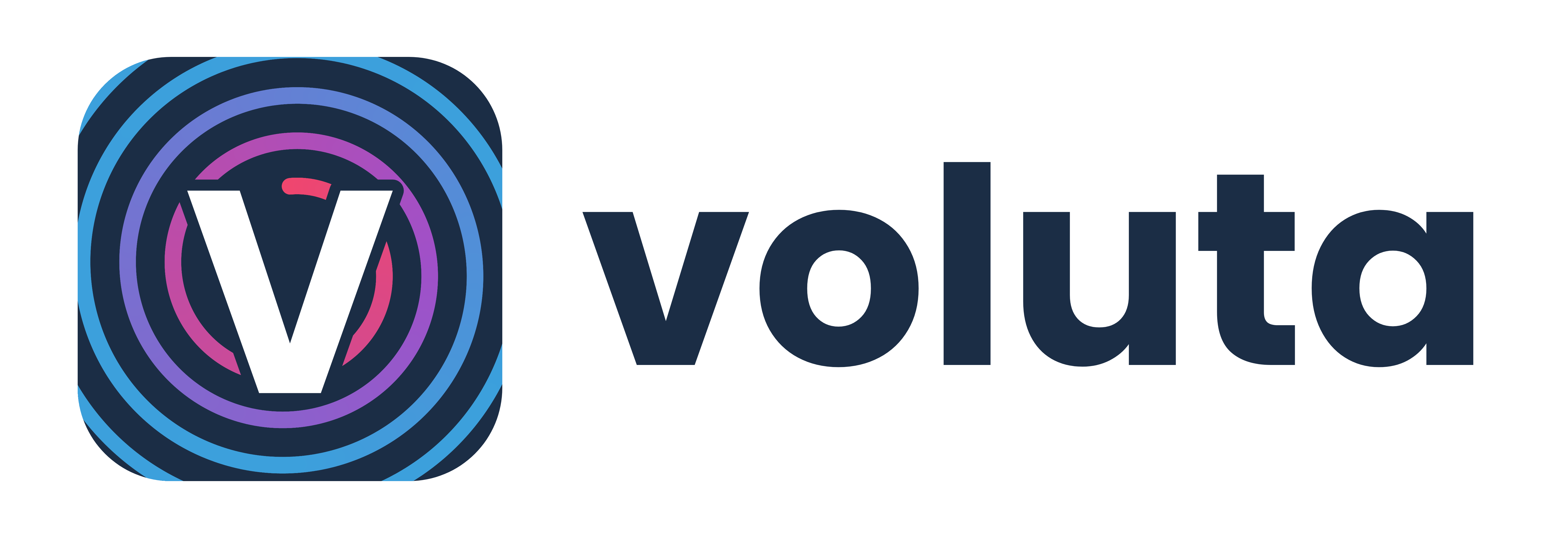
Logo Usage
The Voluta logo is a spiral “V” icon inspired by classical Ionic volutes, paired with the Voluta wordmark. Four variants are provided for light and dark contexts.
Icon — Light
Icon — Dark
Lockup — Light
Lockup — Dark
Clear Space
Maintain clear space equal to the icon height (1x) on all sides.
1x
1x
1x
1x
Minimum Sizes
24px (icon only)
32px (favicon)
Voluta
28px height (lockup min)
02
Color Palette
Every color is derived from the logo gradient. The teal, navy, and raspberry are the three anchor colors. The full palette extends each into a 10-step scale for UI use.
Brand Gradient
#4AADE8#29335C#D81159
Primary Colors
Teal
#4AADE8
114, 158, 161
Navy
#29335C
41, 51, 92
Raspberry
#D81159
216, 17, 89
Rose
#F43F5E
244, 63, 94
Navy Scale (Primary UI)
50
#eef0f7
100
#d4d8ee
200
#a9b1dd
300
#7e8acc
400 ★
#29335C
500
#222b50
600
#1c2344
700
#151a33
800
#0e1222
900
#070911
Accent Scale (Raspberry)
50
#fef0f5
100
#fcd4e4
200
#f9a9c9
300
#f57ead
400 ★
#D81159
500
#b80e4c
600
#960b3e
700
#740830
800
#520622
900
#300314
Neutrals
Ink
#171717
Stone
#6B7280
Fog
#9CA3AF
Border
#E5E7EB
Mist
#F3F4F6
Snow
#F9FAFB
Semantic Colors
Success
#16A34A
22, 163, 74
Warning
#D97706
217, 119, 6
Error
#DC2626
220, 38, 38
Info
#2563EB
37, 99, 235
Dark Mode Palette
Page BG
#0F172A
Card
#1E293B
Border
#334155
Text
#F1F5F9
Muted
#94A3B8
Teal Tint
rgba(114,158,161,0.1)
03
Typography
Arial is the primary typeface. The wordmark uses a bold/light weight contrast as a core brand pattern throughout headings and UI.
display
700 / 48px / -0.025em
Just one more chapter
h1
700 / 36px / -0.02em
Your Reading Journey
h2
600 / 28px / -0.015em
Currently Reading
h3
600 / 22px / -0.01em
Book Club Discussion
h4
600 / 18px / 0
Reading Stats
h5
500 / 16px / 0.01em
Your Notes
h6
500 / 14px / 0.05em / uppercase
THIS MONTH
body
400 / 16px / 0
Track your books, shows, movies, and games all in one place. Your personal media companion for everything you love.
caption
400 / 13px / 0.01em
Last updated 3 days ago — 324 pages
small
400 / 12px / 0.015em
Added Mar 15, 2026
Bold / Light Weight Contrast
The wordmark pairs bold and light weights. Use this contrast in headings and branded text throughout.
Bold 700
Voluta
Light 300
Stories
font-family: Arial, Helvetica, sans-serif;
04
Spacing & Radius
A 4px base unit. Buttons use pill radius (9999px) as a core brand signature. Cards use 12px rounded corners.
Spacing Scale
4px
space-1
8px
space-2
12px
space-3
16px
space-4
20px
space-5
24px
space-6
32px
space-8
40px
space-10
48px
space-12
64px
space-16
80px
space-20
96px
space-24
Border Radius Scale
6px
radius-sm
tags, small badges
8px
radius-md
inputs, search bars
12px
radius-lg
CARDS, PANELS
16px
radius-xl
featured cards
pill
radius-full
BUTTONS, BADGES
05
Components
Live, styled elements built with the brand's design tokens. Buttons are always pill-shaped with solid navy backgrounds. Cards use 12px radius.
Buttons
Cards
STANDARD CARD
Currently Reading
You're 65% through "Project Hail Mary" with 120 pages remaining.
FEATURED
Reading Goal
You've read 18 of 52 books this year. You're 2 books ahead of schedule!
BOOK CLUB
March Pick Discussion
The club is reading "Tomorrow, and Tomorrow, and Tomorrow." Join the conversation.
Input Fields
Default state
Focus state
Please enter a book title
Reading Status Badges
Want to Read
Currently Reading
Finished
Paused
Did Not Finish
Special Badges
Premium
Discussion
Theory
Question
Star Rating
★★★★★
4.0 / 5
Alerts
Info: Your weekly reading report is ready.
Success: Book added to your library.
Warning: Your reading goal is falling behind this month.
Error: Could not save your review. Please try again.
06
Dark Mode
Dark mode uses midnight blue surfaces (#0F172A, #1E293B). Text shifts to light slate tones for comfortable contrast.
Dark Mode Components
All dark mode surfaces use the slate palette. The brand colors stay vibrant on dark backgrounds.
Logo
Buttons
Card
CURRENTLY READING
Project Hail Mary
65% complete — 120 pages remaining.
Input Field
Alert
Info: Your weekly reading report is ready.
Side-by-Side Comparison
Light Mode
Heading Text
Body text appears in Stone gray on white backgrounds for comfortable reading.
Card on Light
White surface, gray border.
Dark Mode
Heading Text
Body text uses Muted slate on dark surfaces for comfortable contrast.
Card on Dark
Slate surface, dark border.